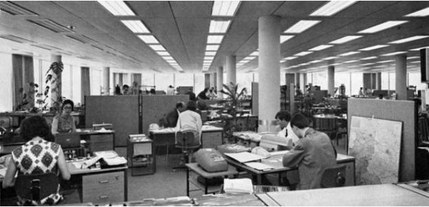
Trends come and go, and if you hang around long enough, you’ll notice that old fads often come back into style, sometimes more than once. Office layouts of 2017 may seem very different from what came before, and this is true in many ways – depending on what ‘before’ means to you. For instance, anybody who attended a school that was designed forty years ago is probably familiar with open concept layouts, and stepping into a modern office isn’t too dissimilar in that sense. On the other hand, some things like office furniture and color schemes have evolved from the velvets and the fifty shades of brown that seem to have been the hallmarks of the 70s.

Photo Source: BBC
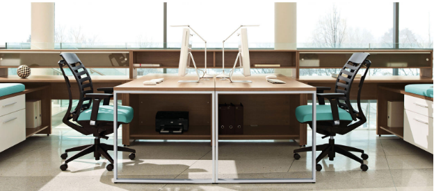
Today’s office color trends are all about tailored experience. It’s important to consider the nature of the business, in addition to other factors like who works at the office and who makes up the clientele. Color choices can impact everything from productivity to general comfort, so choose wisely!

Photo Source: Global Furniture Group
Color for Comfort
When most people think of comfort, they probably think about material wealth or about the tactile aspect of a comfortable experience. In terms of the modern office environment, some obvious furniture-related things probably spring to mind, like an ergonomic office chair or an adjustable height workstation. However, color also plays an important role in contributing to your overall comfort.
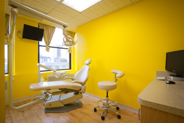
For instance, walking into a dental office painted in cheery yellows and powerful navy blues will probably seem odd, but you might not think really twice about it – consciously, that is. However, the wrong choice of color can impact your mood and your sense of well-being in negative ways. Visiting the dentist is always an uncomfortable experience, and cheery colors like yellow may do the opposite of encouraging your sense of wellbeing in this situation. They may even contribute to a sense of anxiety.

Photo Source: Local Dentist Pro
Offices must therefore think holistically about the notion of comfort when it comes to design, and go beyond simply picking out unique office furniture or trending colors. Even companies who are in the same industry may not be able to carry off the same color schemes.
While a new, exciting electronic banking company that caters to a younger crowd may be able to pull off royal purples and zesty oranges, a venerable investment firm whose clients are mostly retired should probably think twice about such a bold choice… A sixty-year-old on the brink of retirement would probably hesitate about trusting a financial advisor whose office is pink with gold trim.
Color for Productivity
Comfort isn’t the only aspect of work life that is affected by color choices. Productivity can also be impacted by color schemes. Some colors are great for encouraging a sense of calm, while others can invite fun and creativity. You’ll want to pick the colors that are a best fit for the office users – that is the people who work there, and for the people who visit.

Photo Source: Spiritus Advising Group
Of course, what works for the clients isn’t always what works for the workers. If you want to create a tailored color experience, think about how spaces are used. Your reception area should definitely be designed to fit the clientele. On the other hand, if your offices aren’t necessarily client-facing, pick colors judiciously to maximize worker productivity.
Either way, just try not to go out there and choose every color on the rainbow. Carnival fun houses make use of crazy colors and design patterns precisely because when thrown together, you end up with a jarring effect. While you might want your workers to be both calm and passionate, creative yet decisive, mixing up all sorts of colors in a misguided attempt to achieve all effects, the end result is going to drive your office occupants to distraction. Exercise discretion and restraint when it comes to the variety of colors you’re going to use for the office.
On another note, consider using color in small ways as well. For instance, color coding your files – whether physical or digital – can improve your office organization. We see color faster than we can read, so being able to spot files quickly and to properly put away documents is an important skill that will save you time and headaches. Sorting through a bunch of cream-colored folders will be a nightmare if you’ve lost something. If the folders and even the labels are color-coded correctly, your chances of finding what you’re looking for will be greatly improved.
Color Psychology
To assist you in choosing a design palette wisely, here is a short list of some basic colors and their psychological effects.
- Red
Everybody knows that red equates to passion – and aggression. As such, it’s a great color for promoting action, energy and ambition when used in the appropriate doses. Just don’t let it be overpowering, as it can lead people to be irritable and agitated. Not too little either, or it just might encourage manipulative and/or over cautious behavior.
- Blue
Blue is a popular color in many offices, because it denotes honesty and responsibility. It isn’t a fussy color either, promoting a sense of calm and confidence. As such, it’s great for offices, as it allows workers to feel relaxed and open to study. That said, because it’s so chill, it can promote inflexible thinking. If your office situation requires workers able to think on the fly, blue might not be a good primary color choice.
- White
Good old white. You can find it everywhere, and as such, it is often associated as being sterile, detached and boring. That said, white can also be refreshing and cleansing, which is great for promoting a sense of order. It’s also an awakening color, good for new growth and reflection. If you want your space to be always refreshing, clean and neat then you should think about calling an office cleaning service as well.
- Green
Green is all about renewal and balance. It promotes mental clarity, optimism and hope. As such, it also encourages a feeling of prosperity, safety and wealth. Of course, we’ve all heard the expression ‘green with envy’… green might be good in certain shades and doses, but it can also encourage people to be judgmental, and create an environment rife with jealousy, possessiveness and materialistic urges.
These are only some of the many colors that are out there, and it’s always great to get advice from an interior designer when it comes to putting together an office in a professional setting. Everything from office furniture selection to cabinet colors can contribute to workers’ comfort and productivity, so it’s good to make a thoughtful selection with a holistic outlook on design in mind.
