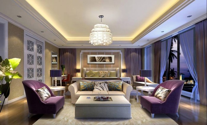
What guides your home design decisions? Intuition? Your friends’ experiences? The opinion of a professional home decorator? As it turns out, all you need to know to create a harmonious interior for your house or apartment is a number of simple mathematical calculations which even seasoned home designers need to remember at all times by SF Home Remodeling Contractor. Here they are:
- Curtains.
- 2 in – that’s the minimal distance between the curtain rod and the window. However, if possible, place the curtain rod right beneath the ceiling;
- 4-10 in – this is how much space there should be between the sides of a window frame and the ends of a curtain rod on both sides of the window. But feel free to increase this value if you want your window to appear wider;
- 2x – the curtain should be at least twice the width of the window;
- 0 in – leave no gap between the bottom edge of the curtain and the floor. You can even leave about 2 in of the fabric resting on the floor to add a bit of elegance to your room.
- Artwork.
- 55-60 in – this is the best-looking distance between the floor and the center of a painting or a poster. Alternatively, you could just hang them at eye level. If you want to hang two or more artworks, think of all of them as a single piece – find a center point for the whole composition;
- 2 in – that’s the minimal distance between two pieces;
- 4-8 in – leave this much space between the topmost part of your sofa and the lowest-hanging artwork.
- Lighting.
- 70 in – this is the recommended height of a floor lamp;
- 60 in – don’t hang your wall lamps lower than this height;
- 3-6 in – that’s how much space you should leave between a wall light and a mirror or an art piece;
- 35 in – the distance between a light switch and the floor;
- 1-2 in – the distance between a light switch and the door frame.
- Furniture.
- 57 in – the best distance between a sofa and a coffee table;
- 10-20 in – the recommended distance between the edges of a carpet and the walls in a medium size room;
- 35 in – this distance between a wall and a piece of furniture is excellent because it won’t obstruct your movement;
- 12 in – the standard bookshelf depth.
- Colors.
- 60% – this is how much space the main color should take up (usually, it’s the wall color);
- 15% – for each of the two additional colors;
- 10% – for a contrasting bright color to add a bit of spice.
The figures mentioned above are recommendations rather than strict rules. Ultimately, you are the one who should make all the decisions concerning the space where you live. If there’s a bold design idea you are crazy about that doesn’t fit in with these guidelines, just go for it!

